
EN
City of Willich
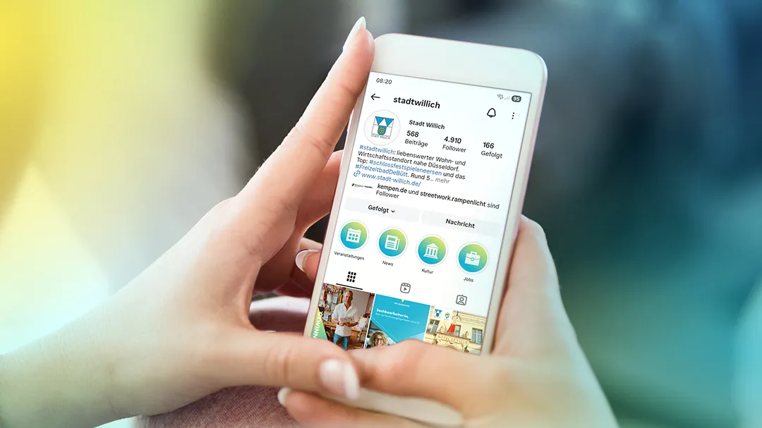
The city of Willich communicates in a variety of ways—on Instagram, Facebook, LinkedIn, and YouTube. Our task: to visually bundle the breadth of content. We developed a flexible design system that connects all channels as a visual bracket.
For a consistent brand image with maximum recognition value at every touchpoint.
We translated the colors of the city logo into a modern gradient. This gradient serves as a recurring branding element that provides orientation without appearing rigid. The logo sends a clear message: this is the official voice of the city.
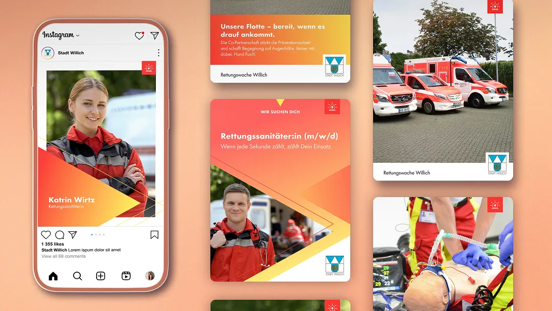
To highlight content from the rescue station in the feed, we use our own color coding and specific icons. This keeps the overall picture consistent while ensuring that important topics immediately catch the eye.
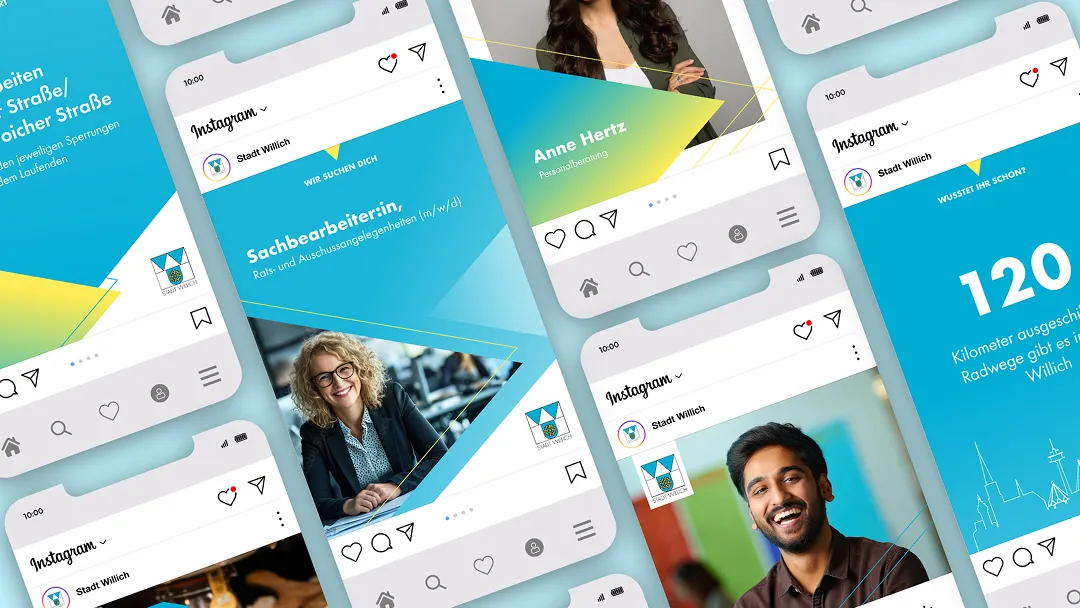
Our goal was to give the editorial team maximum independence. We developed a flexible template system that offers application security: texts and images can be easily exchanged without compromising visual consistency (brand consistency).
Ready to publish: In addition to the design, we also provided the strategic tools. After coaching on tone of voice, formats, and SEO keywords, we handed the channels back to the city. The result: professional community management under their own control.


